Screen saver for sima
| Rating: 2.3!
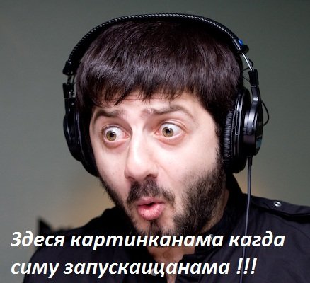
My first work in this area I hope you enjoy!
→ Size:
1 MB
→ Date:
17 years ago (27.12.2008 15:25)
→ Author:
Антон Пушков
→ Approved by moderator:
ReDut
→ License:
Freeware - Free version, Unlimited Distribution
→ Downloaded:
108 time(s)
4
not the font (a good idea)
− qip88,
17 years ago,
#
5
Without any prejudice ..... I like it. And what a font that clearly still waiting for the game default font))), it w as the diversity, and what good, a thousand times to copy the same font))) nice photo, and a good script, "electronic". Then as they say .... more? Let's hope)
− CosmoLaika,
17 years ago,
#
4
The substrate is good. And what type? Such a feeling that all give the original. But sorry - tastes different. Ps Although I can not print it ...
− Vitos,
17 years ago,
#
4
So what do you hit on a guy? Well yes, that "the cat in the bag, it is -1. A splesh funny. Instead, these fonts have not yet been. And what do you all with this "harvesting"? Can people own affairs, but just similar. IMHO 4!
− Teufel,
17 years ago,
#
what he did? written word? Such a delusion can be a hundred pieces a day nashtampovat. And Che, all run on the site? Nah, these conveyor stamping need? where a drop of at least trying?
− Partizan-cs,
17 years ago,
#
Well then, let us close the section "Screen Saver." If all of these oh * WIDE Chuvaky, that a hundred spleshey the day doing, what this circus?
− Teufel,
17 years ago,
#
Teufel, well, if called spleshem any photo to write flight simulator, then okay, let it continue operating conveyor nonsense 5-year-olds ...
− Partizan-cs,
17 years ago,
#
Partizan-cs - agree, but there is also the chapter that you want to see it, and artists?
− Vitos,
17 years ago,
#
Partizan-cs, but what do you expect? Aivazovsky, as I know, simom is not keen on. A 5-year-olds, very even.
− Teufel,
17 years ago,
#
Vitos, SЃRєSЂRyoRЅS‹ from sima. IMHO more appropriate. Teufel, so a drop of at least trying. Generally, this nonsensical debate. This was my IMHO. ;)
− Partizan-cs,
17 years ago,
#
Yes, I agree. Closed the topic =)
− Teufel,
17 years ago,
#
1
ZAGATOFKA HD
− Elliond,
17 years ago,
#
2
!
− Intel_Rus,
17 years ago,
#
1
charming
− Maxim_Utair,
17 years ago,
#
2
Beautiful view ... parking
− Epsilon63,
17 years ago,
#
And, incidentally, not "Centry" and "Century" ...
− SU7,
17 years ago,
#
1
Mutilated nice photo ...
− Partizan-cs,
17 years ago,
#
1
No screenshot, and the very splesh not order more than the font
− ZOLTAR,
17 years ago,
#
generally like the work of the Aga ))))))) - in RyoRЅRµS‚Rµ tons of fonts - it chose, + bylob and you can see that the affairs of others and how it was evaluated + criticism Reading
− ZOLTAR,
17 years ago,
#
1
Wo ist der Skrin?
− Khvostik,
17 years ago,
#
1
We waited for you, Anton! How we missed the first splesham, the lack of screenshots! When viewing a "pig in a poke" was found repugnant to the beauty and color simulation zagatofochny logo on a background of a beautiful photograph. To begin with, that the next time corrected, put the number!
− КурсМП,
17 years ago,
#