dlgsplash
| Rating: 4.9!
+1
4
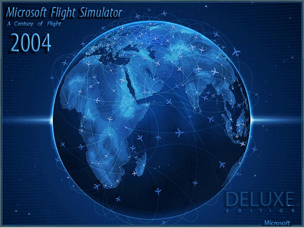
On a globe the idea is good. Just what have the Deluxe Edition? And the text on the top left ... Too small though. For example one could make the font a classic, classic post and make it translucent, so that the globe does not block. Or silver and translucent. Here's how something like that.
− xeon,
15 years ago,
#
5
Обожаю ночные заставки.
− Aero-Sennin,
13 years ago,
#
5
Unusual! but I would have made a bigger name of the game.
− kirill100,
15 years ago,
#
5
for the first time great
− Zikki,
15 years ago,
#
4
not bad but needs work!
− RAID74,
15 years ago,
#
5
And you know that ... I liked it! But I still stands and will stand this: http://www.avsim.su/f/fs2004-zastavki-splash-screens-47/splash-skrini-aviakompanii-vladivostok-avia-28603.html
− Roma1364,
15 years ago,
#
Do not tell the GOP, while not jump
− Zikki,
15 years ago,
#
horror)
− ryabov_912,
15 years ago,
#
5
OK!!!
− HardFighter,
15 years ago,
#
5
I like the truth had little to increase the brightness:)
− Karstar,
15 years ago,
#
Well done. Almost good. As already noted, "2004" should be different. Consider the composition. In the center of the ball, he was chief, it should focus attention. Text block "Microsoft Flight Simulator 2004" distract attention from the main, because he isolated the effect of volume. This effect here is clearly superfluous. Eye is caught between the ball and the text. It's annoying. Remove the effect of making plain text, and everything will fall into place. Just do not overdo it with the contrast on the text, make it the same as the "Delux", do not forget that the main thing - the ball.
− Rulexy,
15 years ago,
#
Thank you for your very good explanation in the next paper uchtu
− abbass80,
15 years ago,
#
5
If you take something that is out of everything, without talking 5!
− pantera19,
15 years ago,
#
5
.
− madara-exgta,
15 years ago,
#
5
beautiful, now looks more like 2004 would, as a whole is beautiful!
− -АНДРЮХА-,
15 years ago,
#
5
I also want Deluxe Edition)
− Vladimir_76,
15 years ago,
#
+3
spleshku stake and they will be deluxe
− Эрник,
15 years ago,
#
5
something that is ...
− Ту154М 85123,
15 years ago,
#