PMDG 747-400 Transaero
| Rating: 3.3!
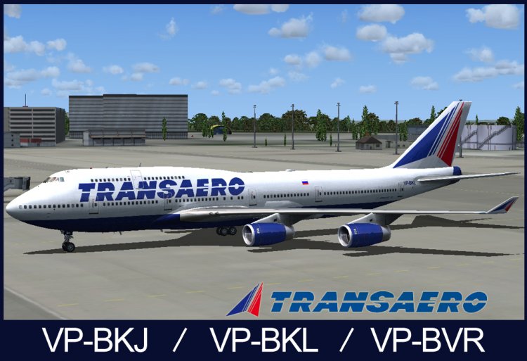
Processed livery for pmdg 747-400 from distributing board VP-BKJ, VP-BKL, VP-BVR
→ Size:
7 MB
→ Date:
16 years ago (28.06.2010 20:12)
→ Author:
Артем Харьков
→ Approved by moderator:
Denizzz
→ License:
Freeware - Free version, Unlimited Distribution
→ Downloaded:
1964 time(s)
5
если это получилось то о будующем профи я не сомневаюсь. молодец. каждый труд он должен как то быть одобрен ибо человек старался.
− oleg713,
13 years ago,
#
2
nde, do not know how, do not do
− pilot-bess,
16 years ago,
#
+1
You should not write, let them draw, only improves the quality.
− serg09,
16 years ago,
#
2
I'm not special in this regard so far, but it is pathetic fake! could glance FIRST PICTURE!
− Zorgair,
16 years ago,
#
I love clever otrisuy whether Dobor fotoreal sides and I thank you first write it.
− Samovarart,
16 years ago,
#
you have a logo does not even correct!
− Zorgair,
16 years ago,
#
Find me in nete prvilny logo in vinyl or otrisuy in ilyustratore) and I'll be satisfied and over again
− Samovarart,
16 years ago,
#
my livery that cantors do not need and generally somewhere on this site laid out in the forum logo known airlines or at serg09 Ask!
− Zorgair,
16 years ago,
#
or are you look-http: / / www.logotypes.ru/
− Zorgair,
16 years ago,
#
Look for himself early in nete all left ((
− Samovarart,
16 years ago,
#
2
There are many inaccuracies, judging only by screens pumping did not, in addition to the wrong logo, the inscription on the fuselage to the left side dolzhnabyt on Russian, not the flag, the RR engines in the wrong place, wrong windows. That's the comparison for the future http:/ / www.airliners.net/photo/Transaero-Airlines/Boeing-747-444/1728563/L/
− Kain,
16 years ago,
#
logo two weeks ago, corrected by its board PS do not look a gift horse in the mouth boys)
− Samovarart,
16 years ago,
#
At Avsime still like watching:). You point to the drawbacks of your work, and you came up against the horn, and alongside the VP-BKL 4dvigatelya RR RB211-524H here are photos poblizhe.http: / / www.airliners.net / photo / Transaero -Airlines/Boeing-747-444/1544898/L /.
− Kain,
16 years ago,
#
Yes, I did not argue slipped in hurriedly had to be laid out for the flight since the local livery all fuzzy) is pererabotany board bkj who needs Keane
− Samovarart,
16 years ago,
#
3
No offense to the author, but the texture is not done right! Especially the logo on the tail, in addition to count-va red and blue lines (where they should be "4x4" pieces, not as we see the "3x3") because these lines are crooked, not in the photo, the first blue line altogether incredible proportions. Well, a number of errors, which I enumerate laziness. =) Ps Compare to the photo.
− serg09,
16 years ago,
#
) With windows on the sides do not match well, and I have already learned later but the most interesting thing that I took the logo from the brand book trance can not know it was full of a left (((very eyes Corn
− Samovarart,
16 years ago,
#
5
ATP All clearly and accurately!
− dkalitnikov,
16 years ago,
#
5
Staged, prescribed, uploaded - all fyuzyulyazh bruised, as if his 10 years of not being painted. This is so conceived?
− dron66666,
16 years ago,
#
Specify about the bruises did not seem to beat him)
− Samovarart,
16 years ago,
#
[email protected]
− Samovarart,
16 years ago,
#
Sent two Scrin
− dron66666,
16 years ago,
#
5
Thank you. I respect Transaero!
− ko4eBNik,
16 years ago,
#
what?
− Singapore,
16 years ago,
#
I like their Levrault =) Lokonichno and tasteful
− becass,
16 years ago,
#
-1
1
Texture does not work
− Arm_O,
16 years ago,
#
) All works well you do not have to sharte in sime
− Samovarart,
16 years ago,
#