Su-24
| Rating: 4!
+1
3
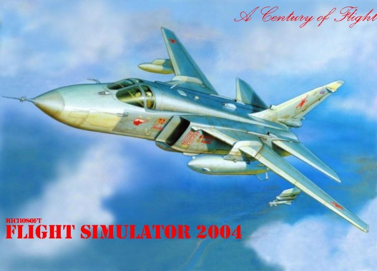
The very picture nothing, but that's inscription, it was necessary to work on this well, not at all nicely turned out, the eyes are not happy. The upper inscription, word Flight generally goes to the right. Red and bold, I think too dazzled, but personally I think so.
− Ravnmm,
16 years ago,
#
+1
5
Super! Come again!
− Mishka80,
16 years ago,
#
+1
4
So-so ...
− VYLL,
16 years ago,
#
You can see it in FS2004 this aircraft? I suspect that there is not. Su-24 somewhere in there. But he looks not so nice and realistic. Consequently, for FS9 or make a visual model and texture of this quality (for which all tell you thank you very much). Or we assume that it's still a simulator are not there yet. In addition, the font is terrible. And the placement of the inscriptions is contrary to the laws of composition. If you want to do something for MS FS 2004, then why not use a standard logo? Just out of a respect for the program, which use ...
− Karadag,
16 years ago,
#
for some reason the picture looks like a scan with a box from under the model aircraft .... kakbe not impressed ... I will not spoil the estimate, but please take into account the author's remark.
− RAID74,
16 years ago,
#
From Su-24M (MR) zvezdovskogo:)
− Эрих Хартман,
16 years ago,
#
-3
The picture is not bad, although still Flights civilian Sim.
− boss2051,
16 years ago,
#
-4
Strong did not kick:)
− Angelpro,
16 years ago,
#
-1
stupid comments think not.
− RAID74,
16 years ago,
#
-5
3
Not! Where watermelons with Bobby?
− Nebes787,
16 years ago,
#