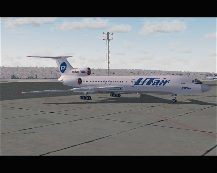
PT Tu-154M UTair
| Rating: 4.3!
5
Tilt letters, incidentally, is not crucial to see. But if memory serves, the box next to Russia, the Control should be strictly rectangular, without chamfer. But to anyone, V«hideV» beautiful and we got a minor shortcomings do not spoil and the aerodynamics are not affected))) So, in the work of V«5V»
− SLI=PEGAS_23=,
18 years ago,
#
Thank you for RєRѕRјRјRµRЅS‚S‹ next time I'll get better. ;)
− Pilot-154,
18 years ago,
#
5
Excellent! Thank you for your work! PS Tilt really not true ...
− isaev,
18 years ago,
#
4
The location and slope of the inscription letters wrong: (Especially noticeable slope.
− Mitch,
18 years ago,
#
3
Thank you very much for the texture of your favorite airlines, but due to the presence of gaps more to RЅRµRјRѕRіSѓ ...
− Epsilon63,
18 years ago,
#